PRAXO
A construction and architecture practice finding its form.
Before Praxo had a name, it had a way of working. The client had been developing freelance projects in construction and architecture for years, but needed a brand that could hold what he was building: clear enough to communicate today, flexible enough to grow tomorrow.
INDUSTRY:
Construction & Architecture
LOCATION:
Long Island, New York
SERVICES:
Naming, Brand Strategy, Verbal & Visual Identity
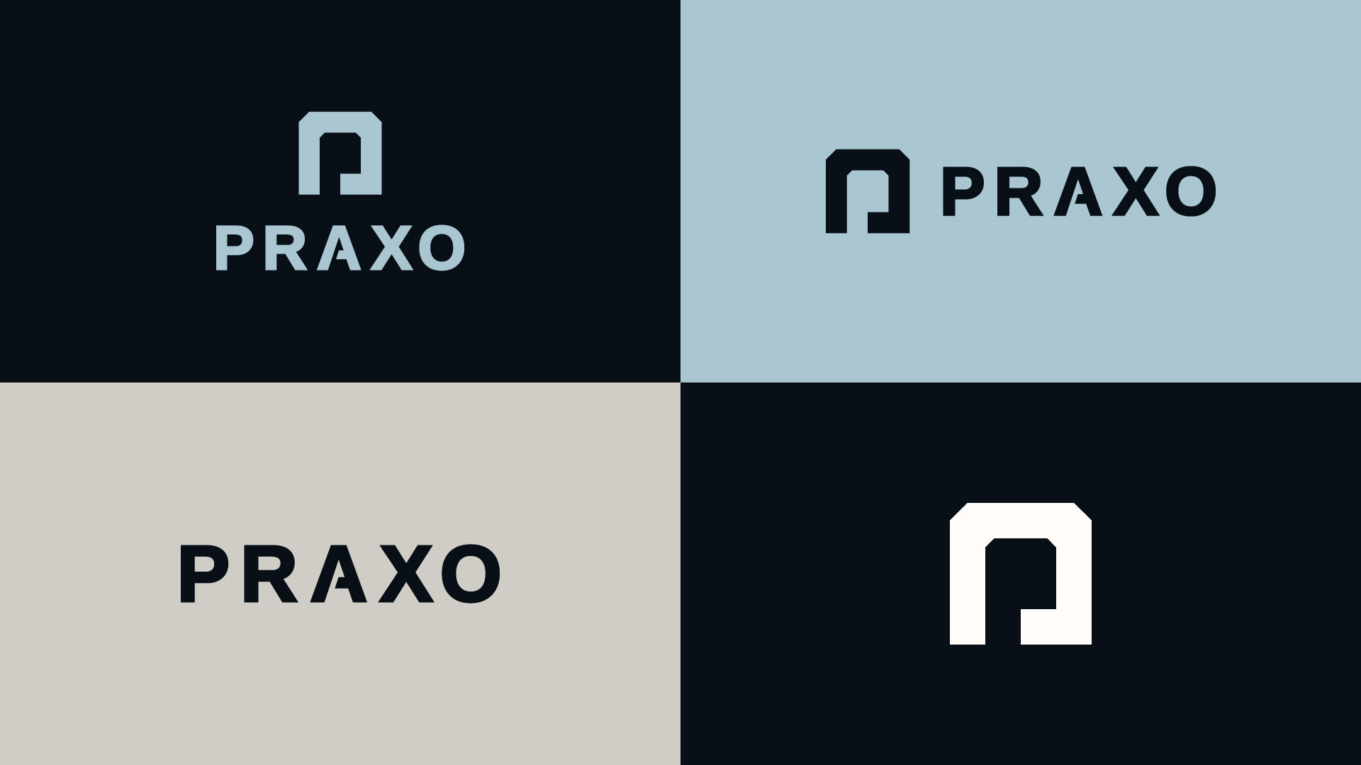

The name came from the union of two ideas: “praxis” (action guided by reflection) and “trazo”, the Spanish word for a drawn line. Together they form something precise and intentional. A name that doesn’t just describe what Praxo does, but how it thinks.
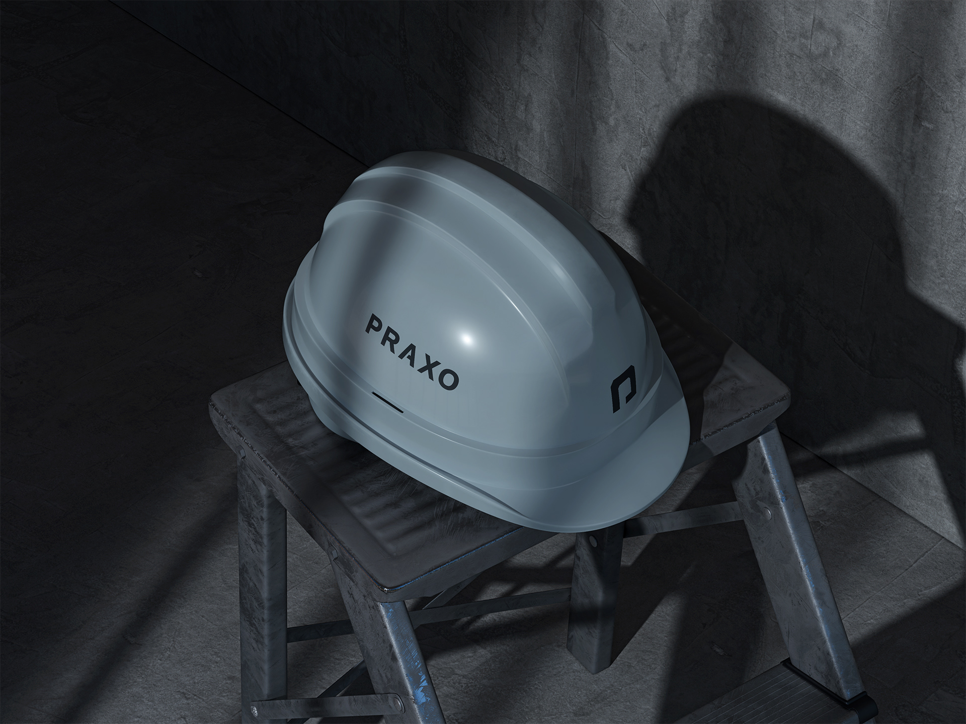
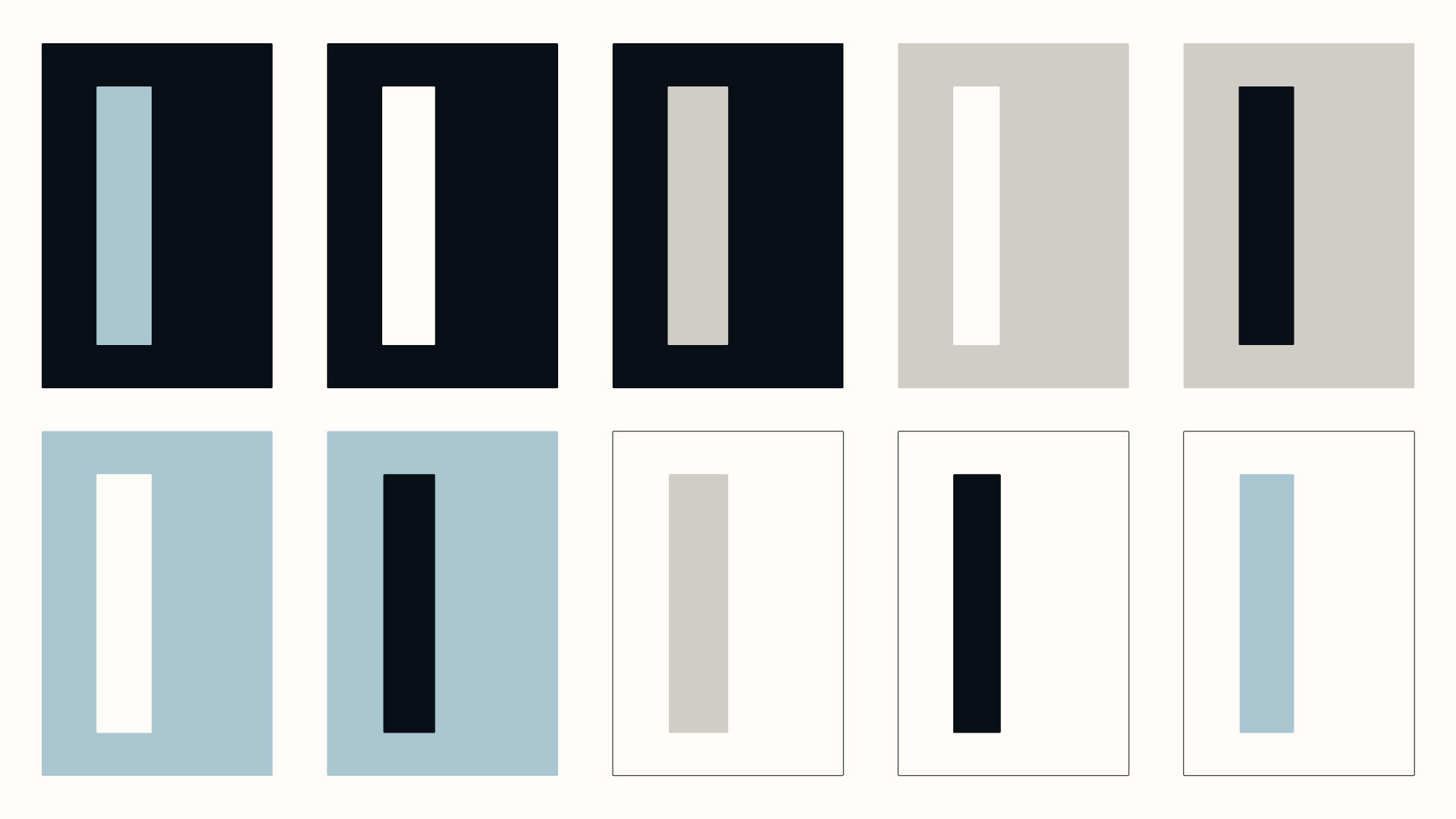
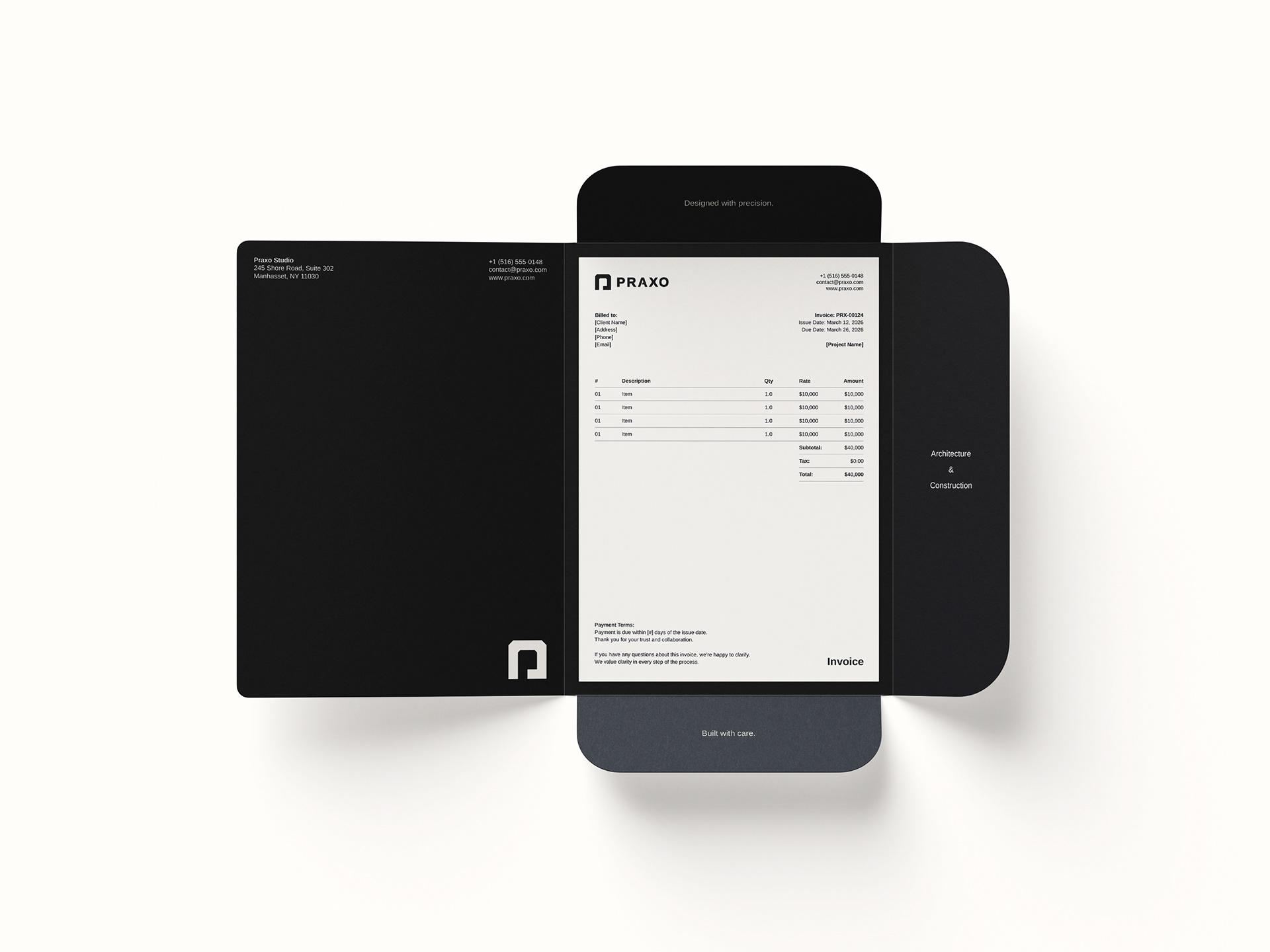
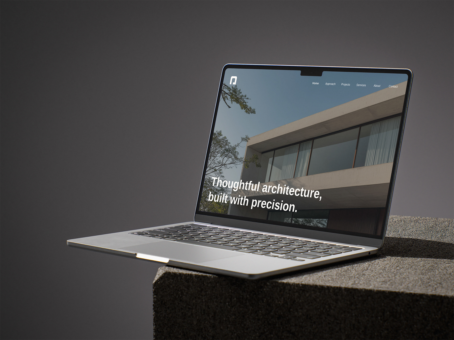
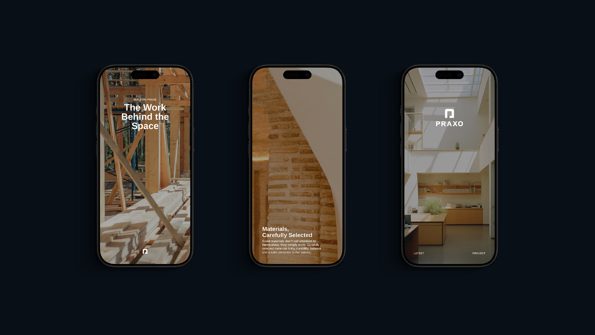
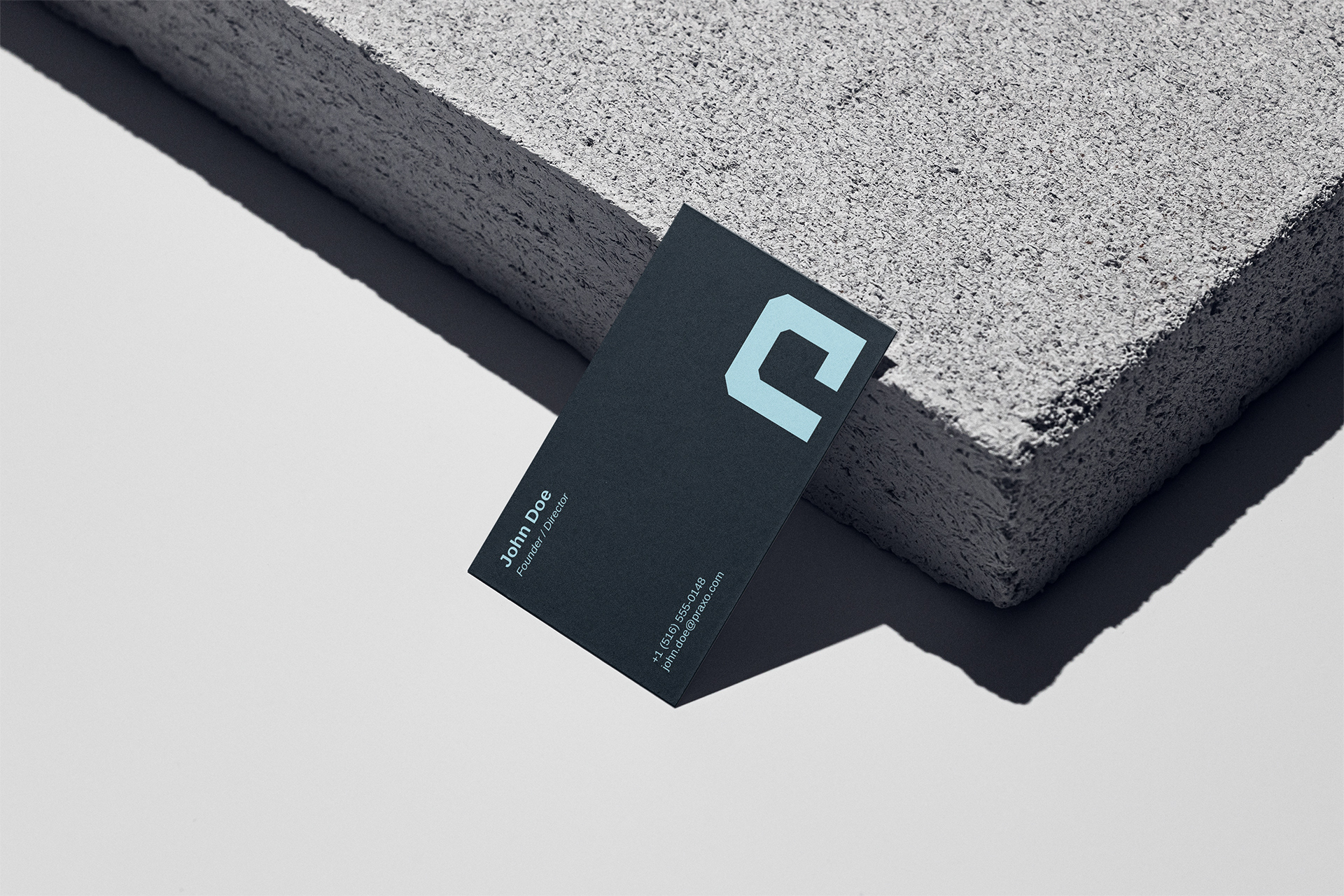
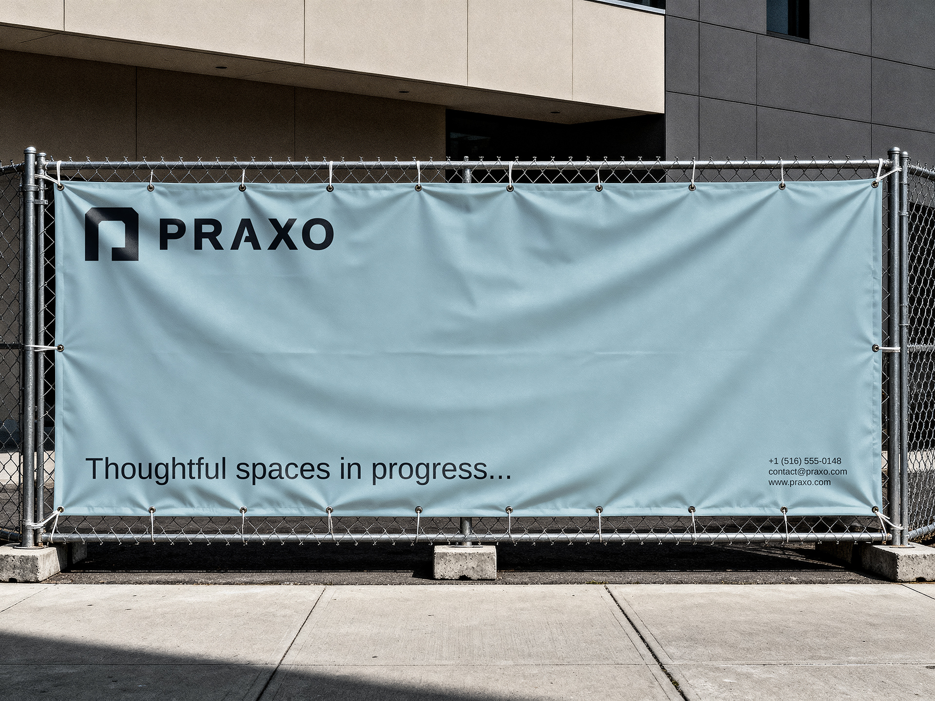
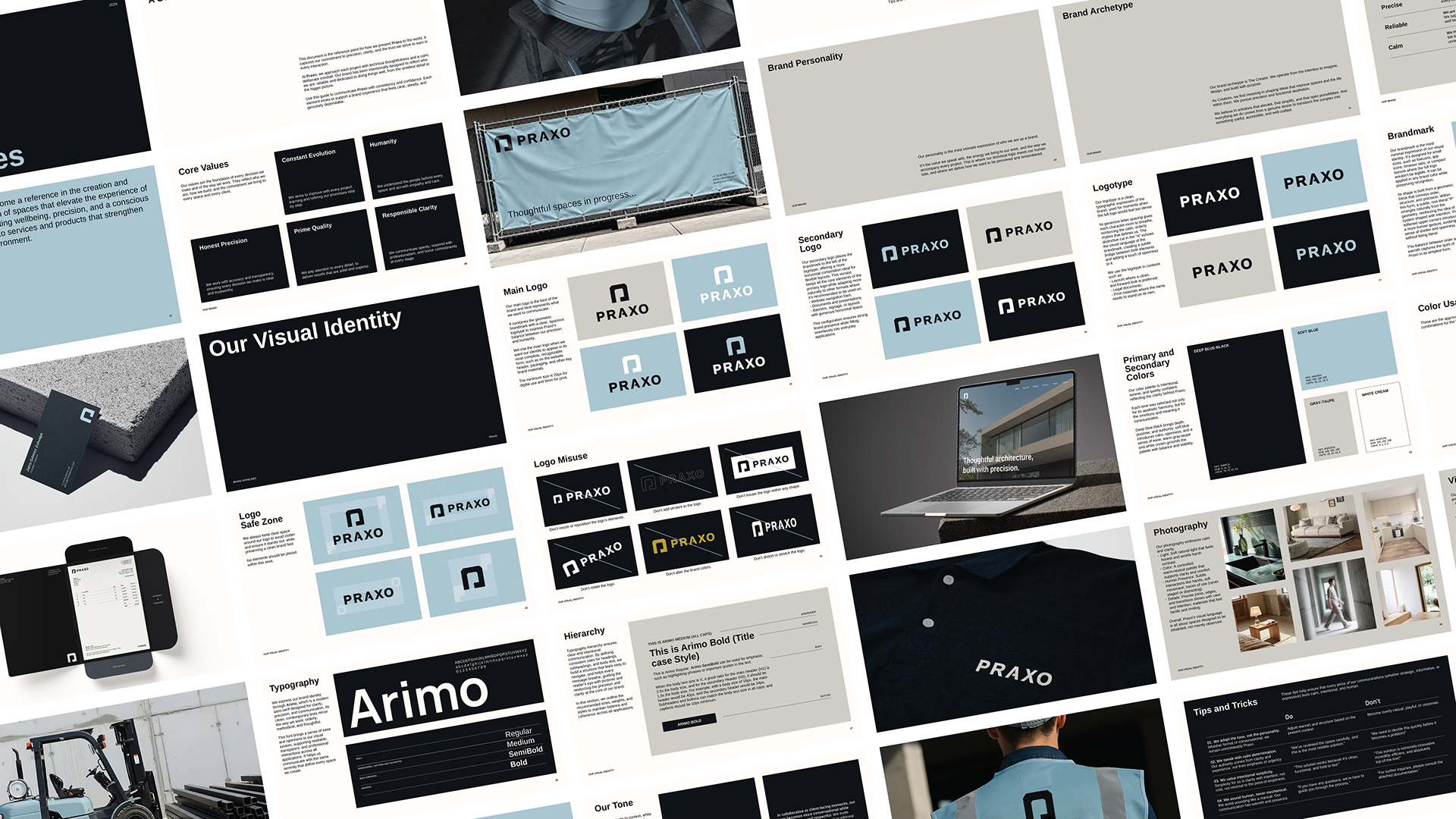
The visual identity was built around the same tension: order and humanity. The brandmark emerges from a single structured block but its corners carry a subtle intervention that softens the geometry without breaking it. A system that feels both reliable and warm.
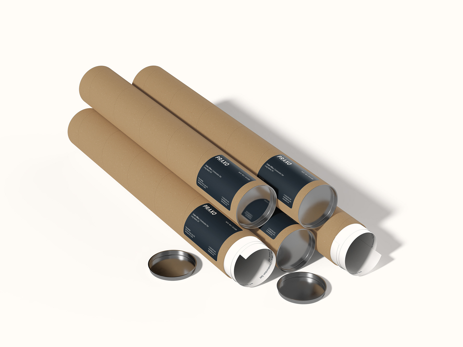
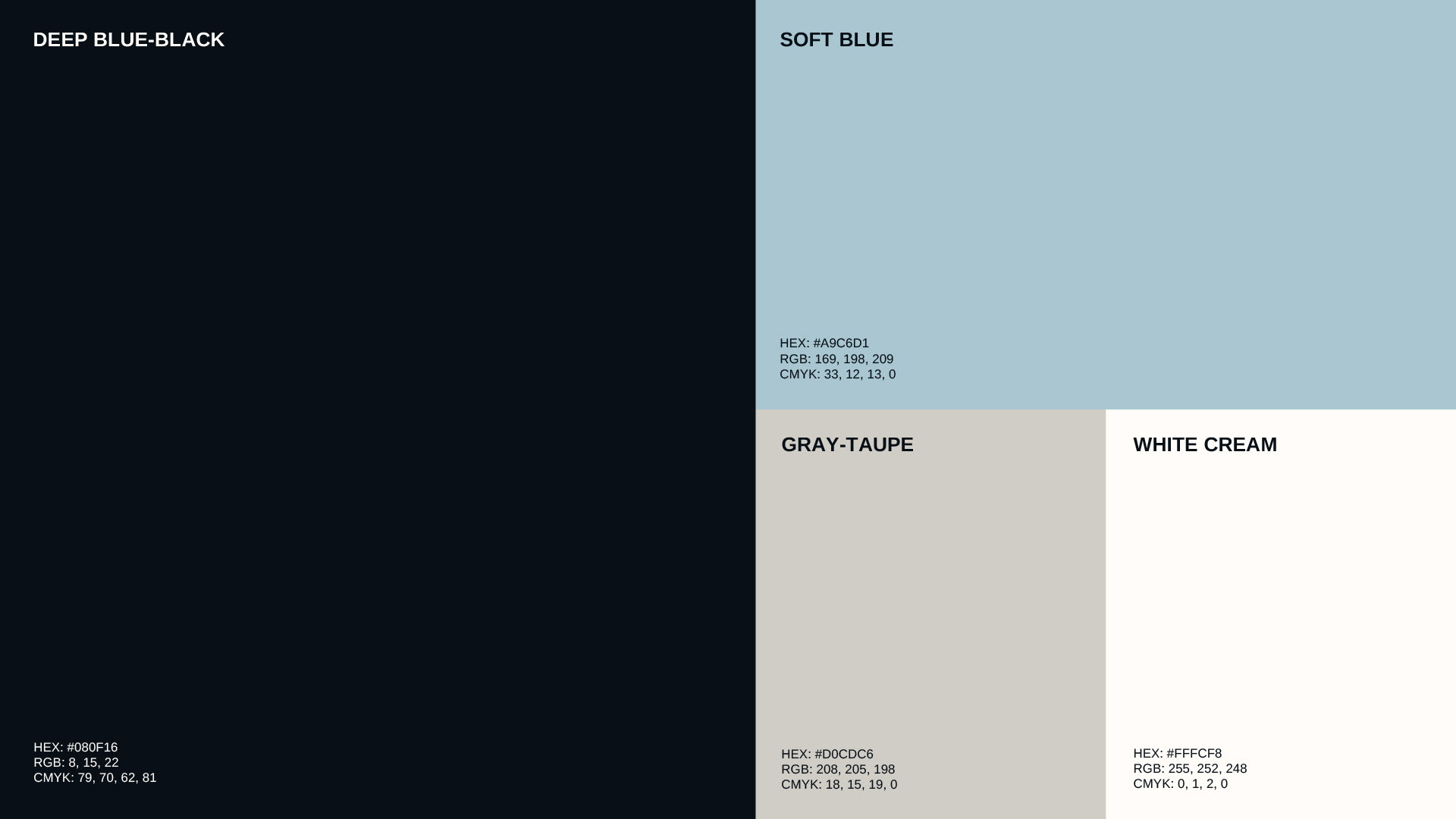
Color deepens that intention. Deep, serene tones anchored by warmer, lighter hues; bringing stability that doesn’t feel cold. Typography is clean and contemporary, holding the system together without demanding attention.
And the brand voice follows the same logic: calm, clear, intentional. Praxo speaks with precision because it thinks before it speaks.
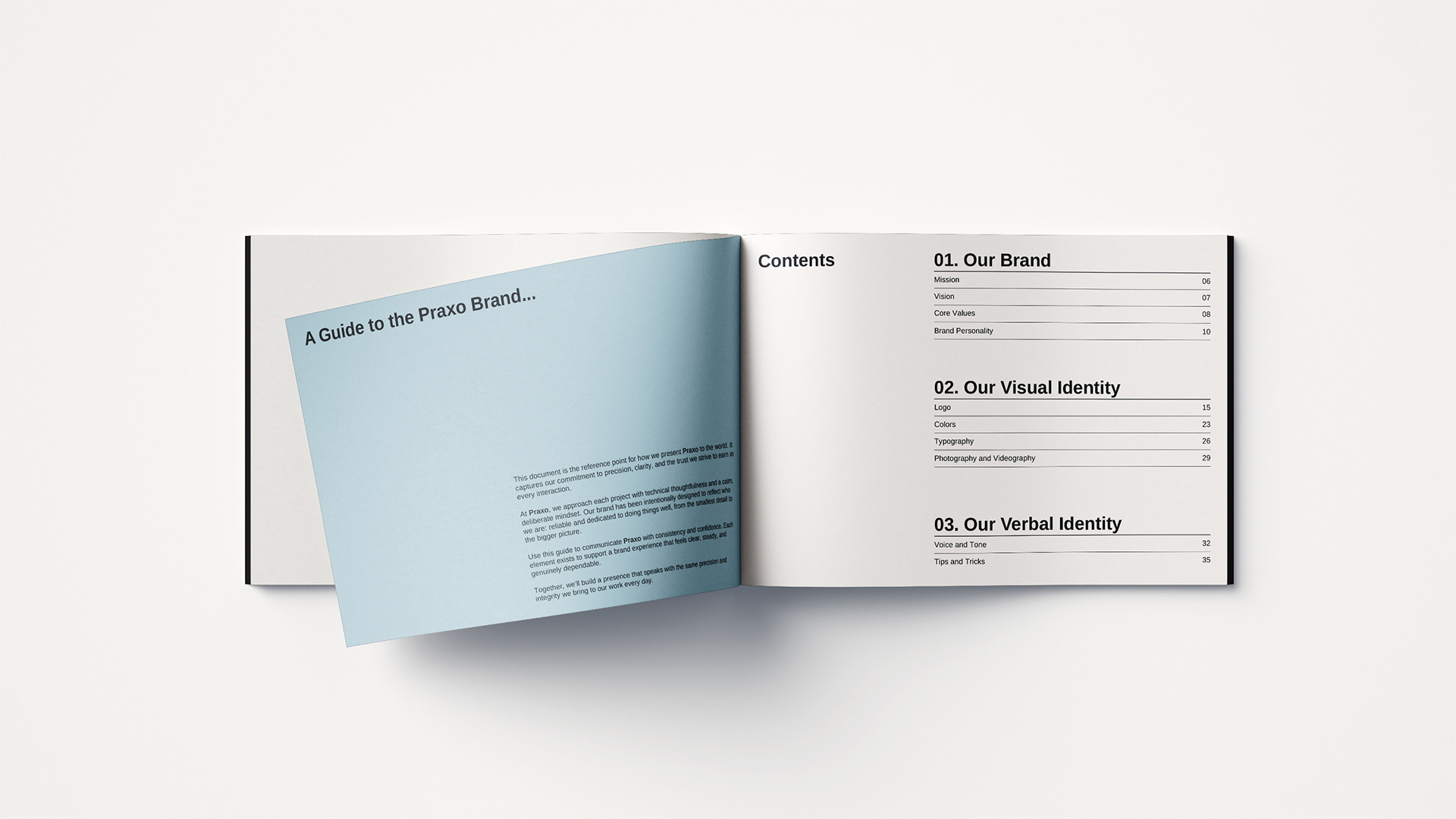
More than designing a brand from scratch, this project was about giving shape to a vision. Listening, understanding, and building a simple, solid system that reflected a way of thinking and doing, conscious, precise, and deeply human.