STRATITGEN
A strategic partner, built to grow alongside the businesses it serves.
Stratitgen arrived with a name and a clear ambition: to accompany small and mid-sized businesses through strategy, technology, and marketing. The challenge was giving that ambition a shape, one that felt solid and approachable at once, without collapsing into the generic language of the consulting world.
INDUSTRY:
Business Strategy & Technology
LOCATION:
United Stated
SERVICES:
Brand Strategy, Verbal & Visual Identity
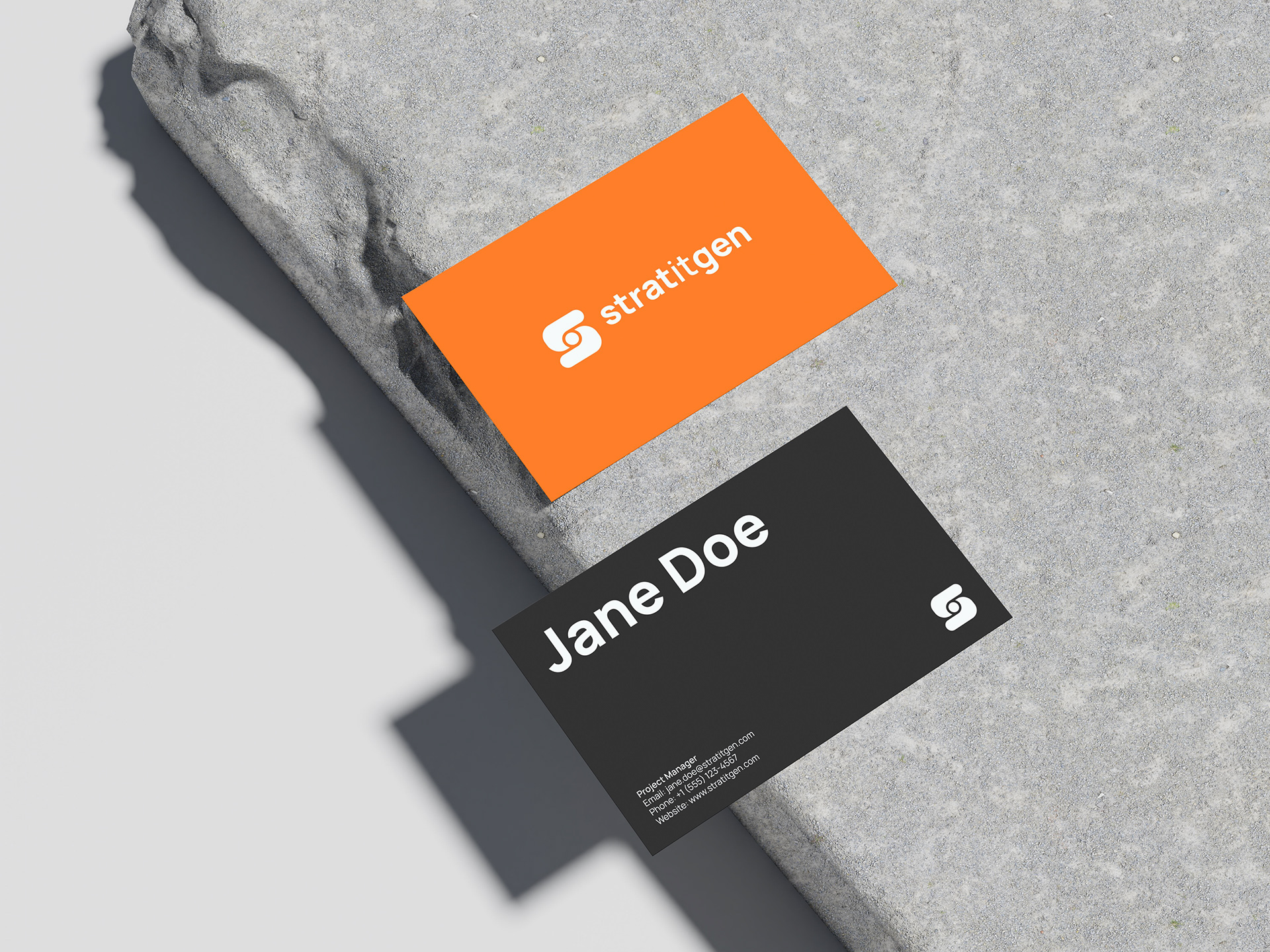
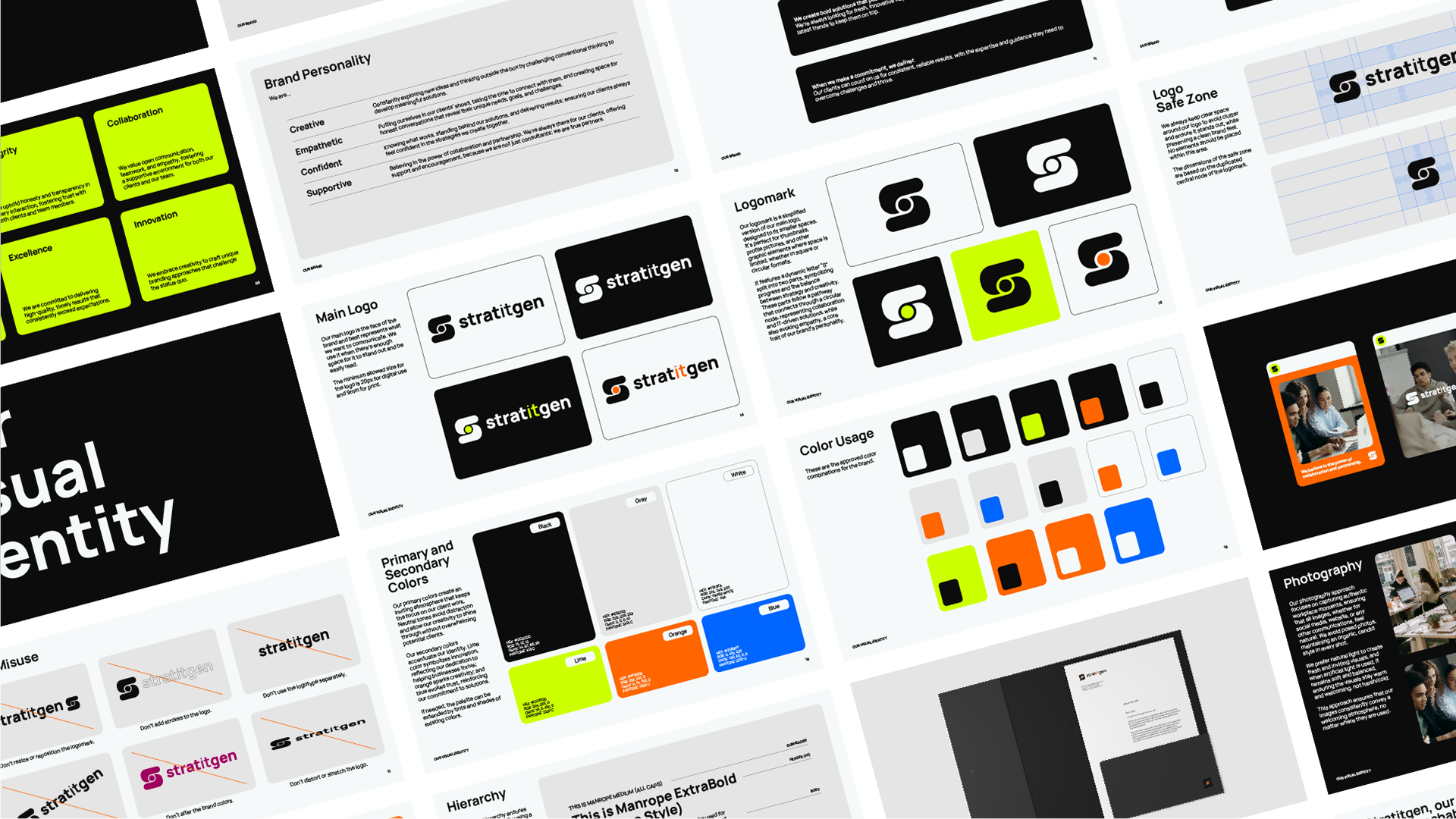
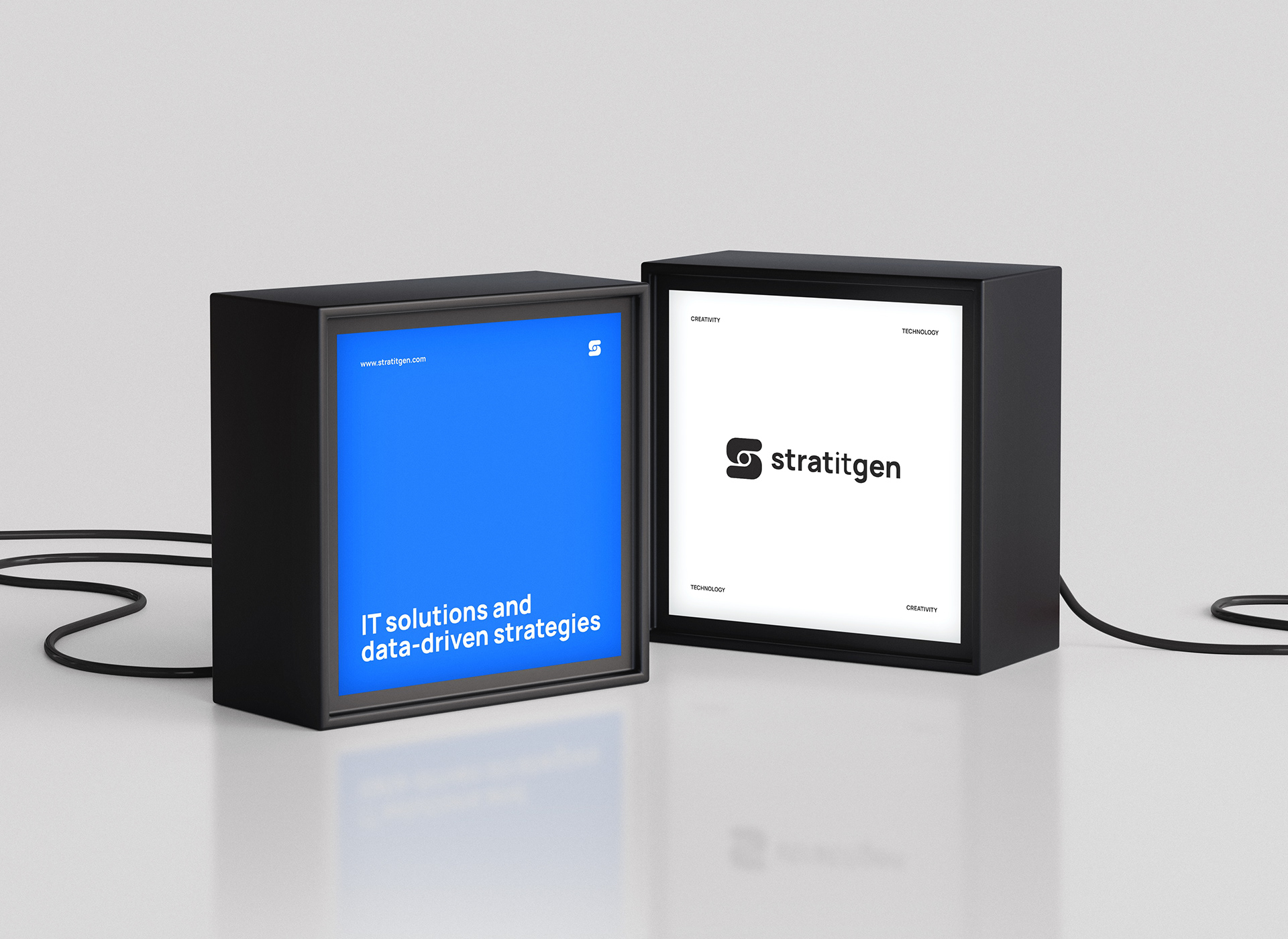
The brandmark is built around a dynamic “S” divided into two parts, connected by a central node. That node does the conceptual work: it represents collaboration, progress, and the role of technology as a meeting point between a business and its potential.
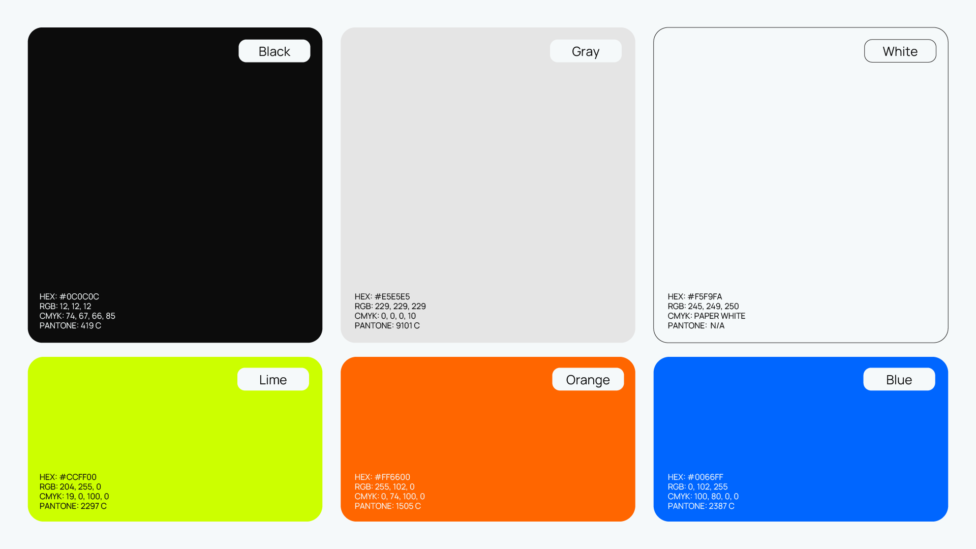
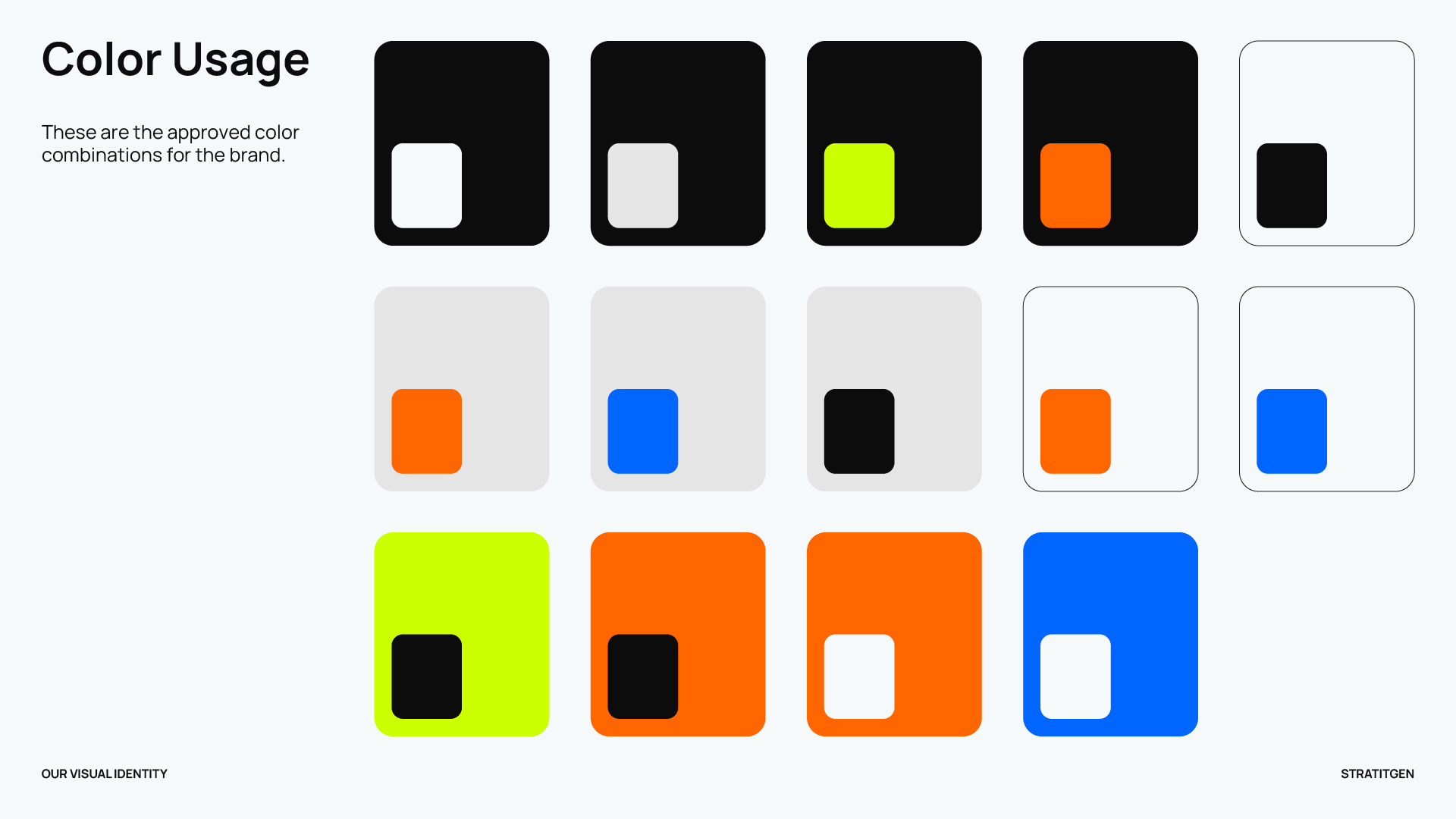
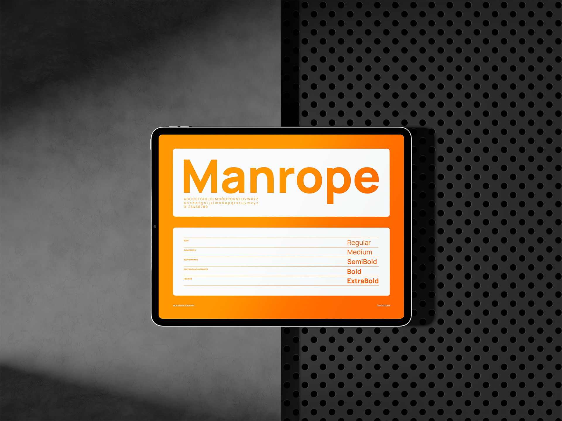
Color was kept restrained. Neutral tones hold the focus on the client’s work, while secondary colors introduce intention (innovation, creativity, confidence) without competing for attention. Geometry carries through into the typography, staying clean, contemporary, and accessible without sacrificing professionalism.
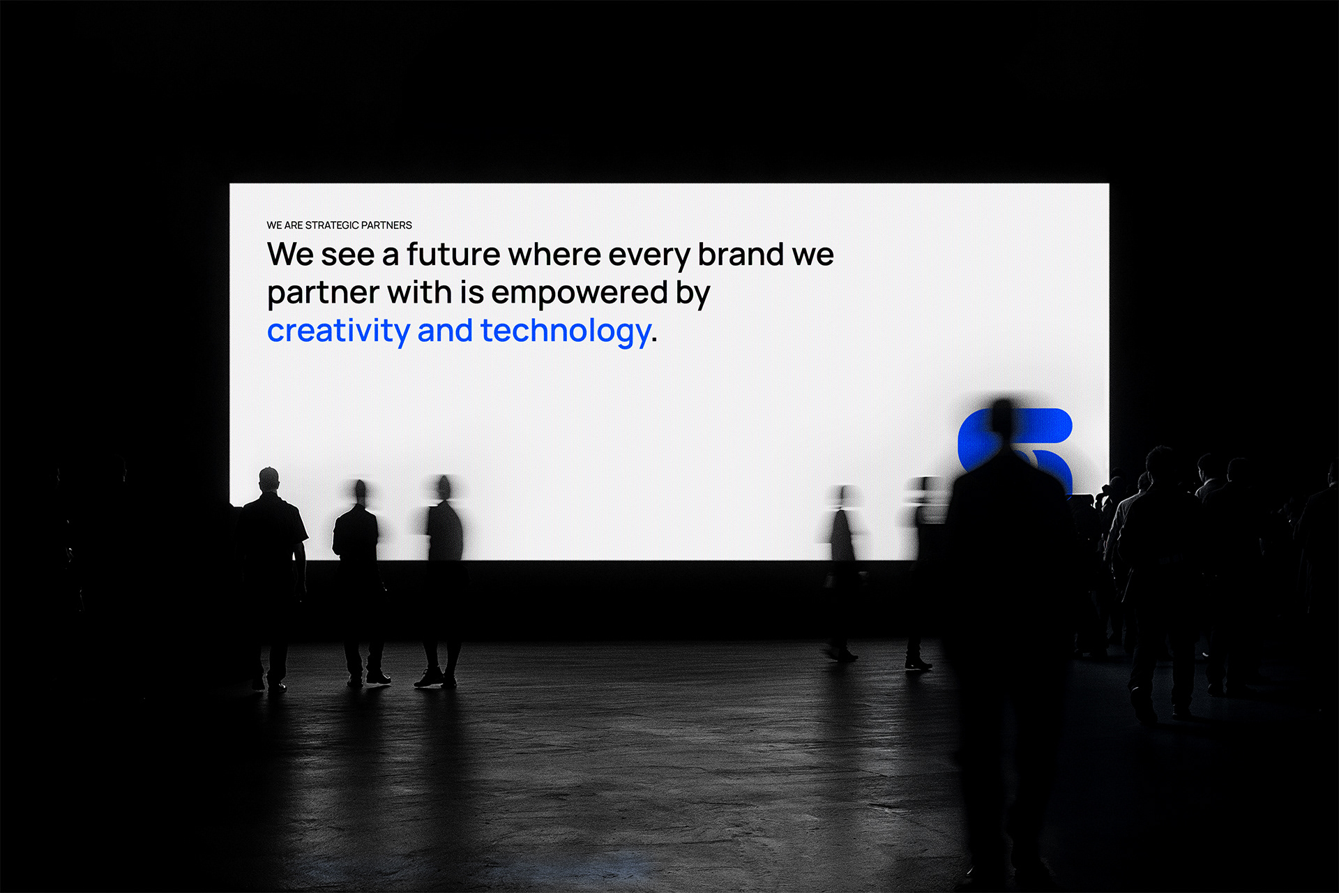
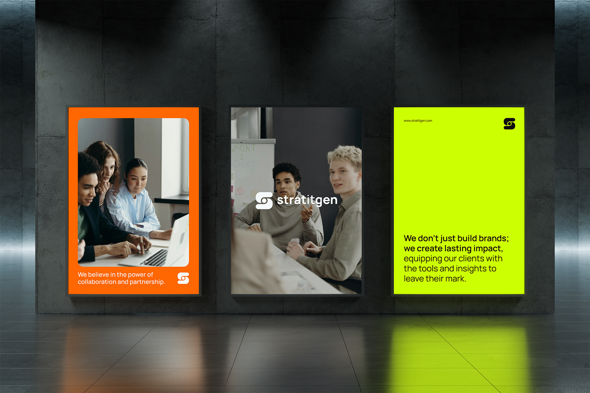
The verbal identity follows the same logic. Stratitgen’s voice is clear and confident, but never stiff; it sounds like someone who understands the problem before offering the solution. Knowledgeable and warm, professional and human. A brand that earns trust by feeling like a partner, not a vendor.
This project was about taking something broad and real, and building a system around it that was clear enough to communicate today and flexible enough to grow tomorrow.