VIREO
A brand built around the ritual of presence.
Vireo means to be alive, to flourish, to grow green. The name arrived before the brand did, and everything that followed had to live up to it.
The client’s vision was clear from the start: a space where coffee and reading become an invitation to slow down. It’s not a café brand, not a content brand, but something quieter than both. The challenge was building an identity that could carry that depth without tipping into the clichéd or the decorative.
INDUSTRY:
Coffee, Lifestyle & Content
LOCATION:
New York
SERVICES:
Visual Identity
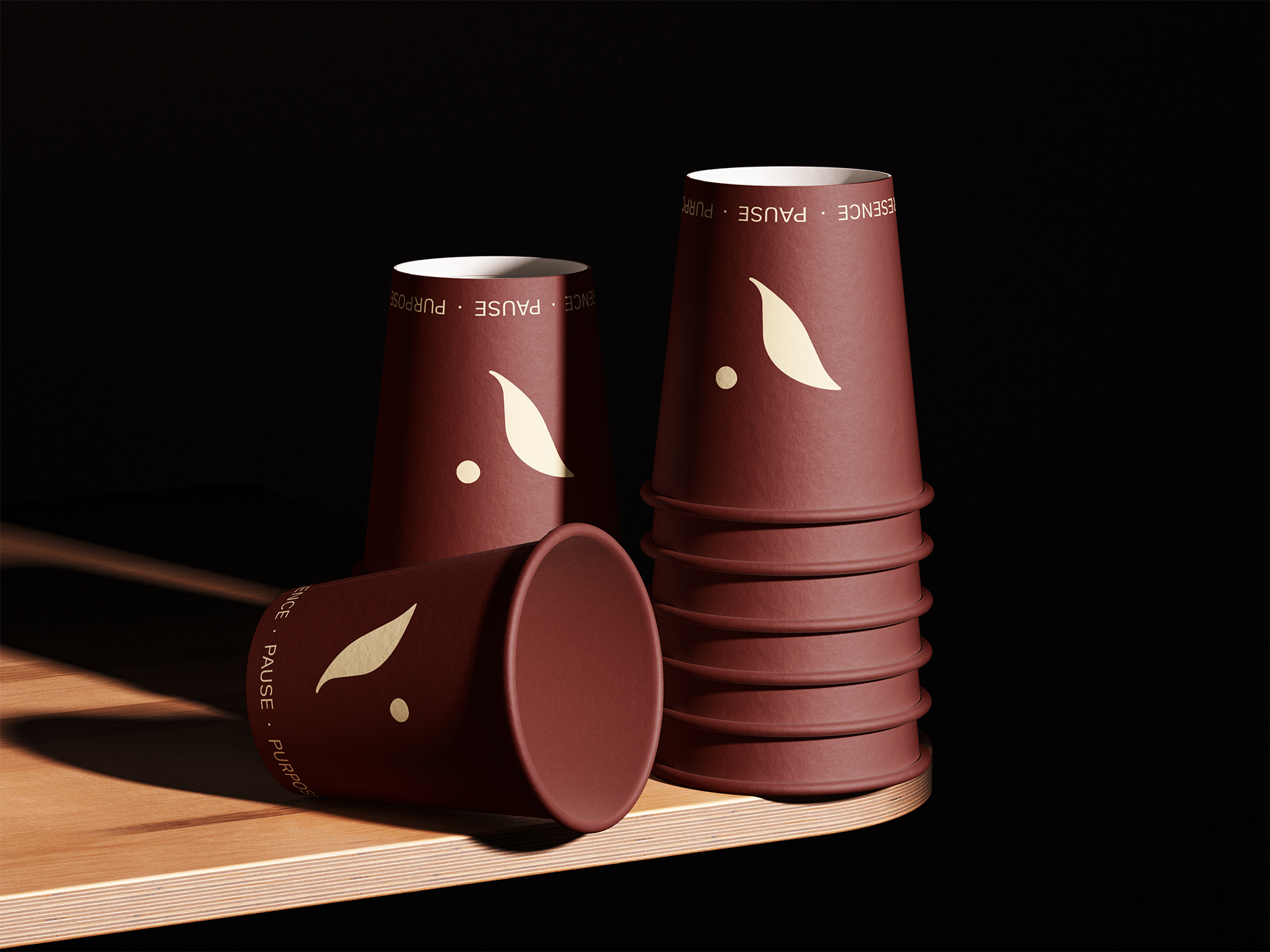
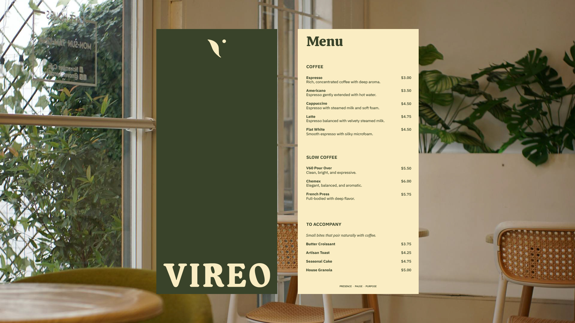
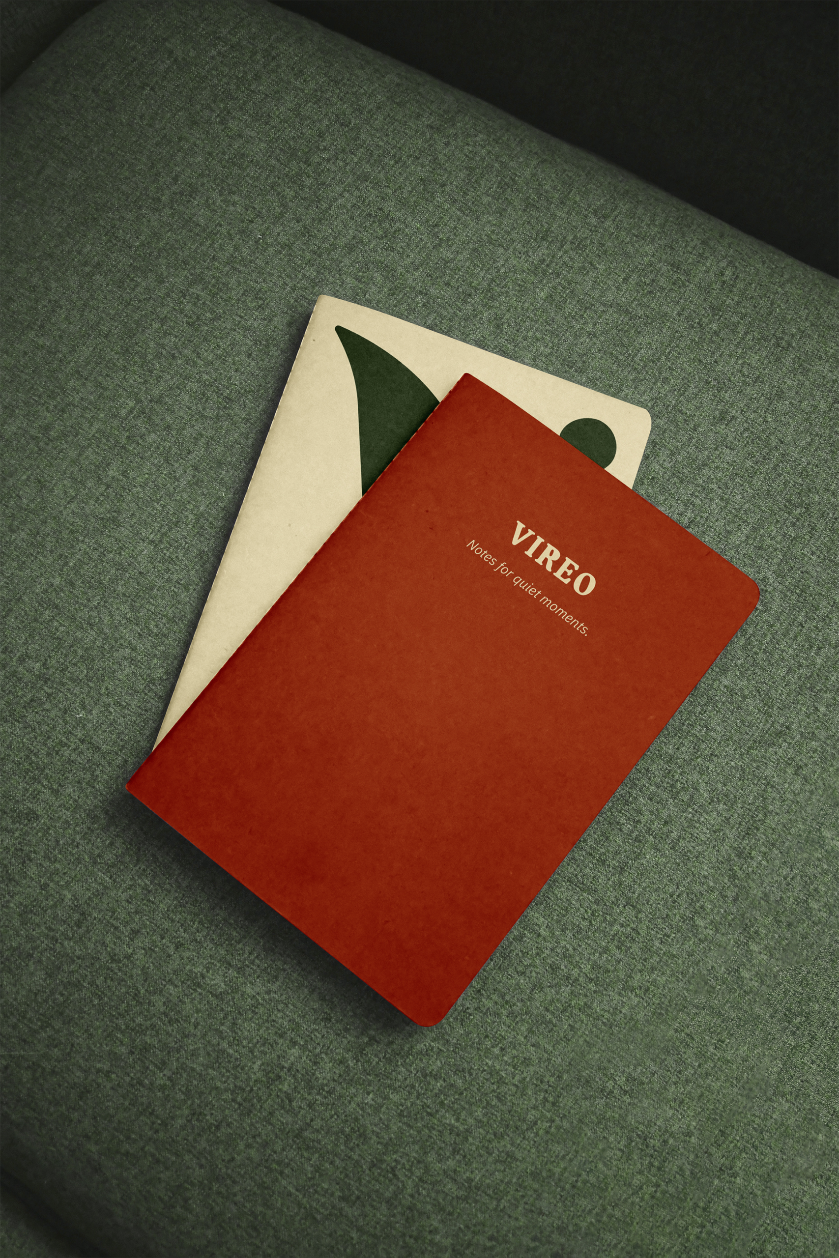
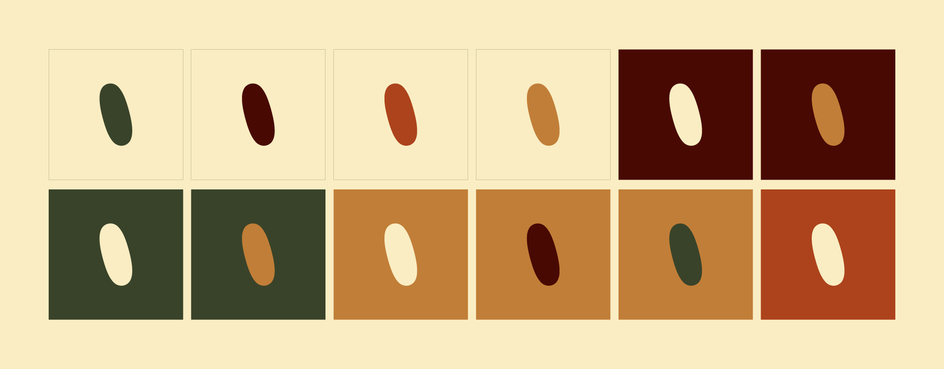
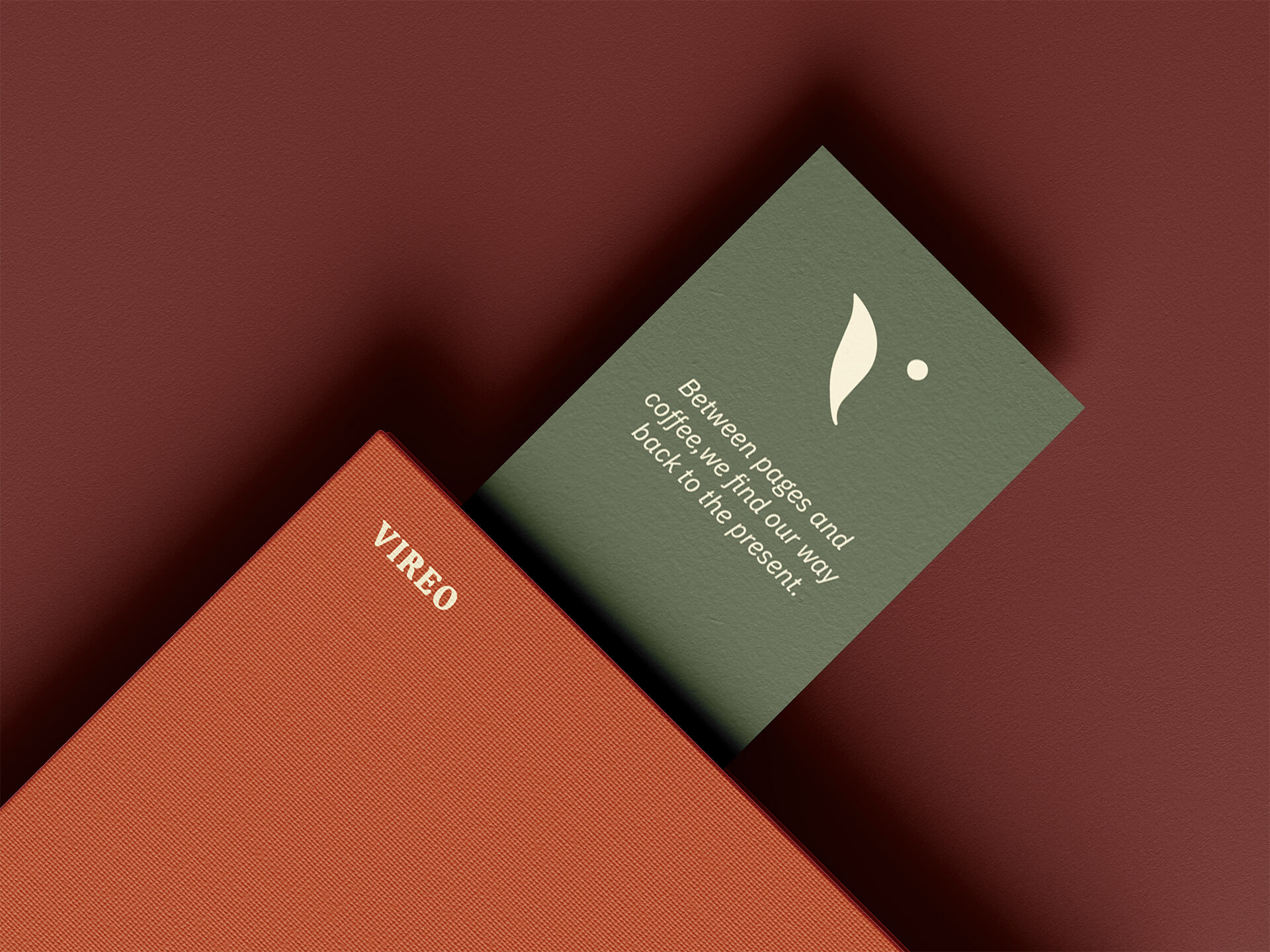
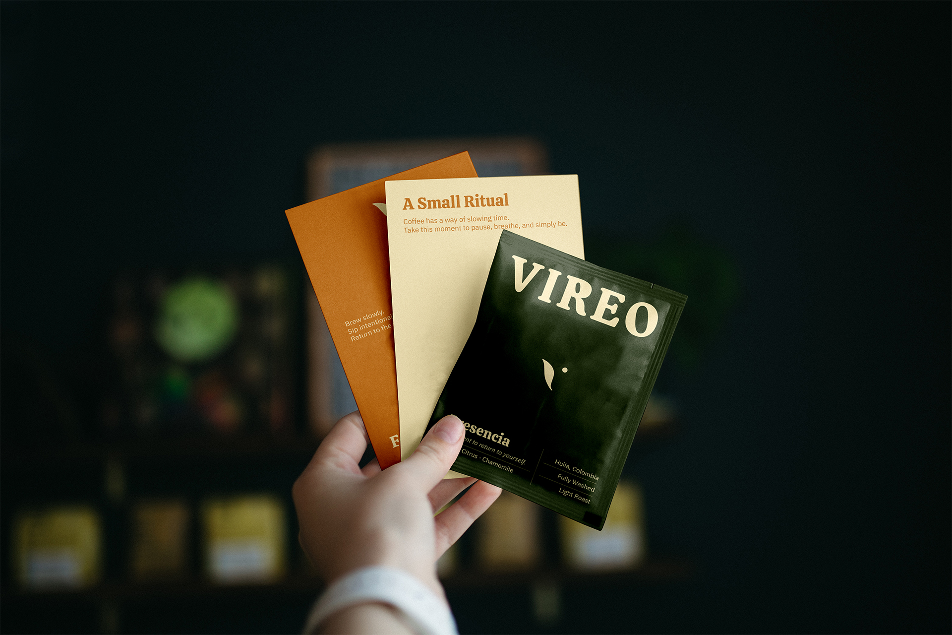
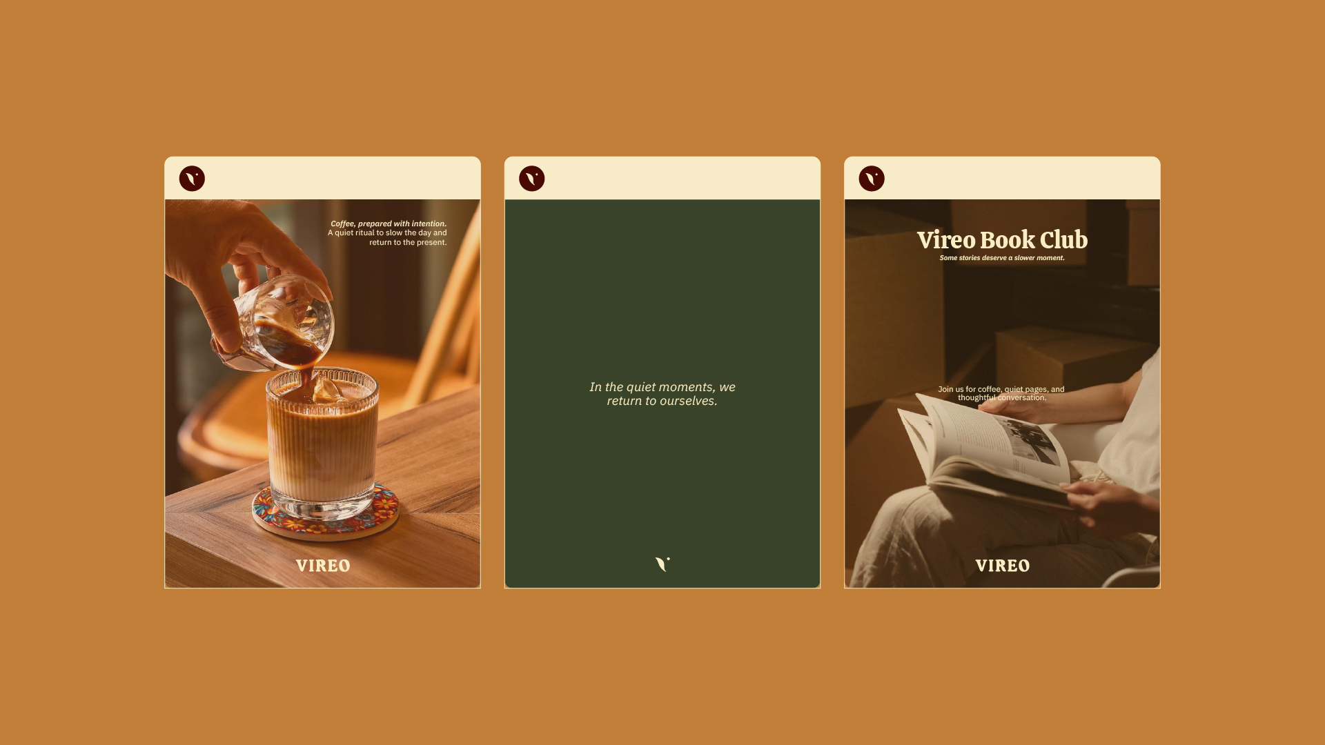
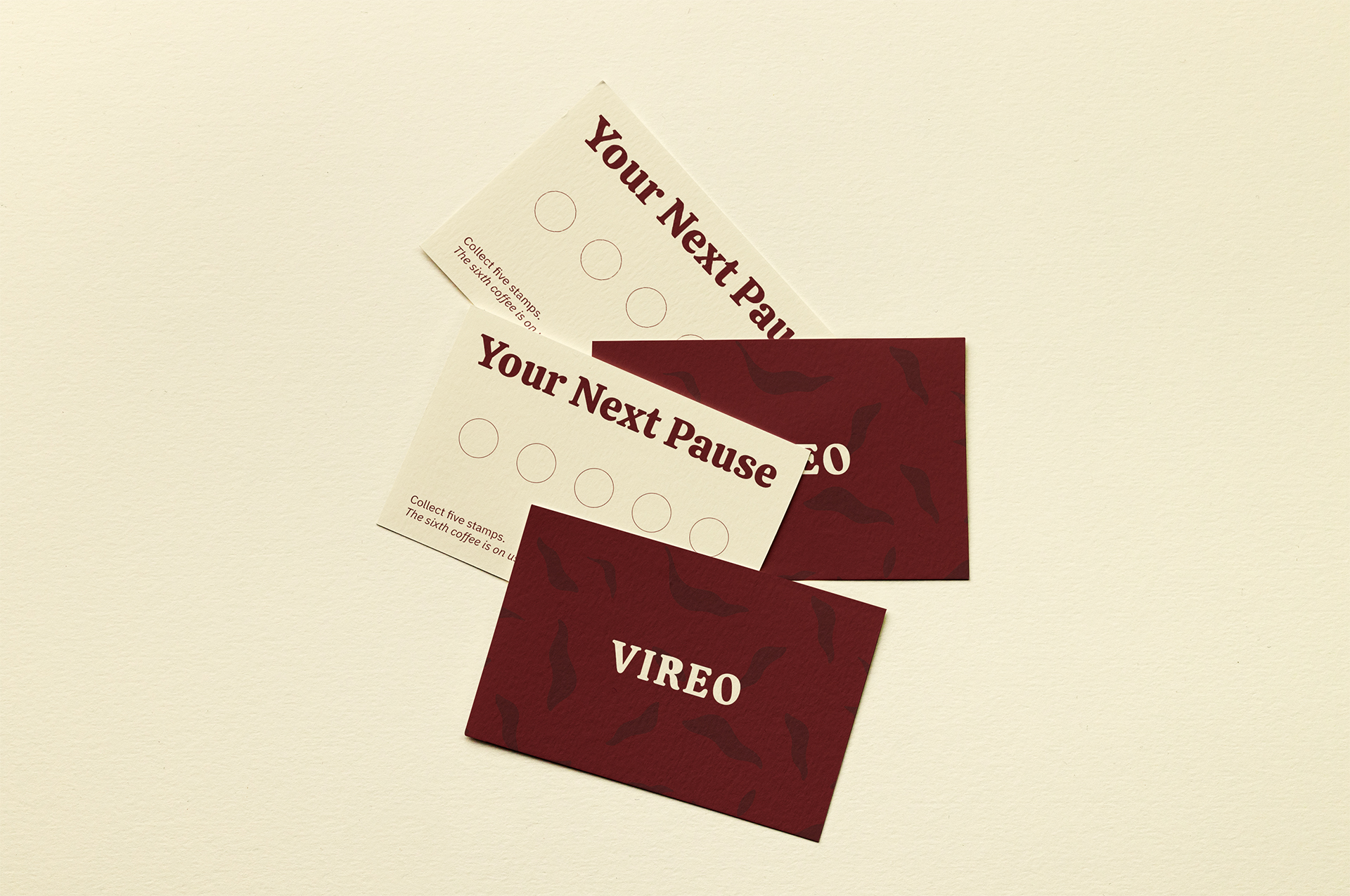
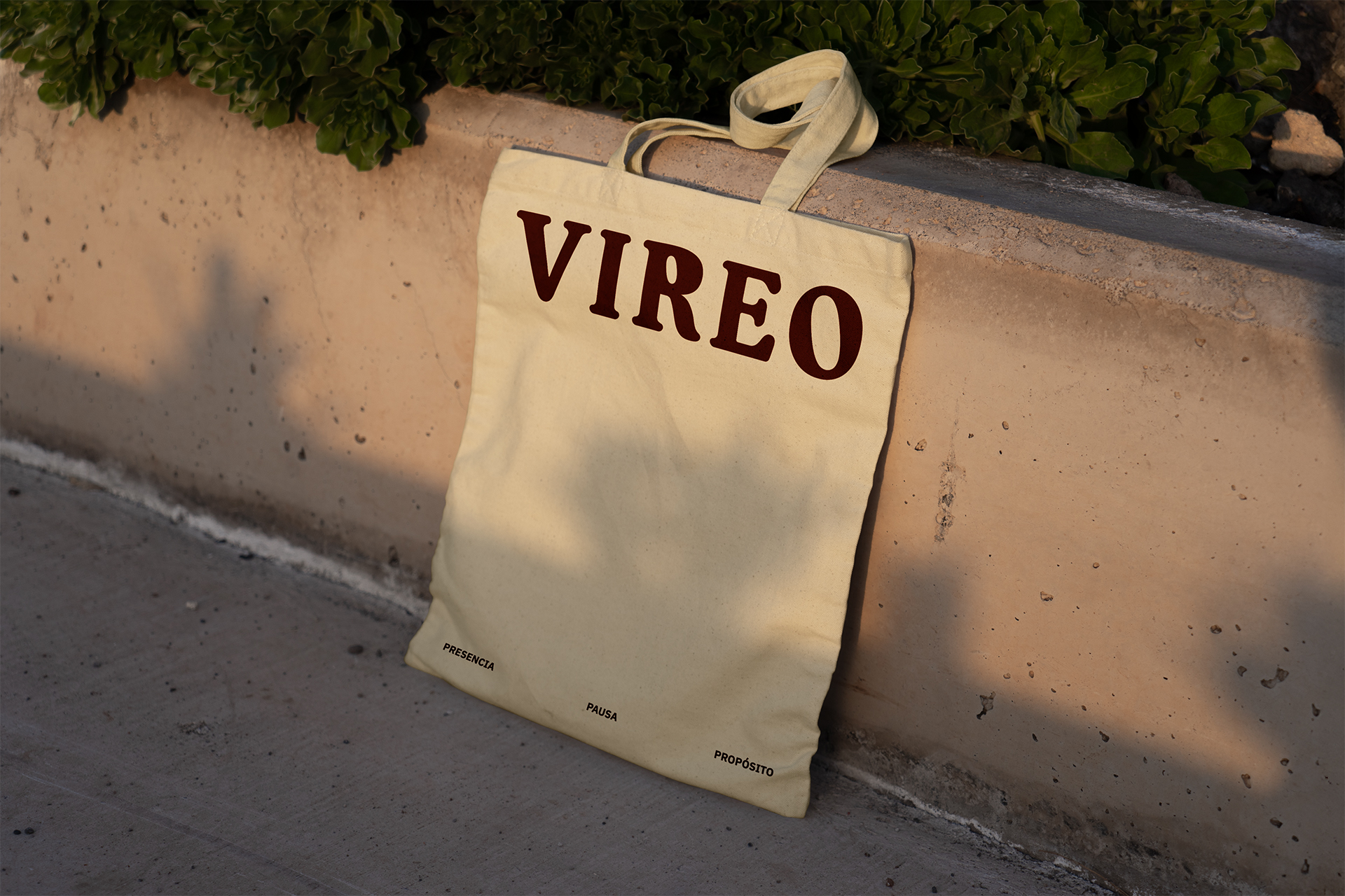
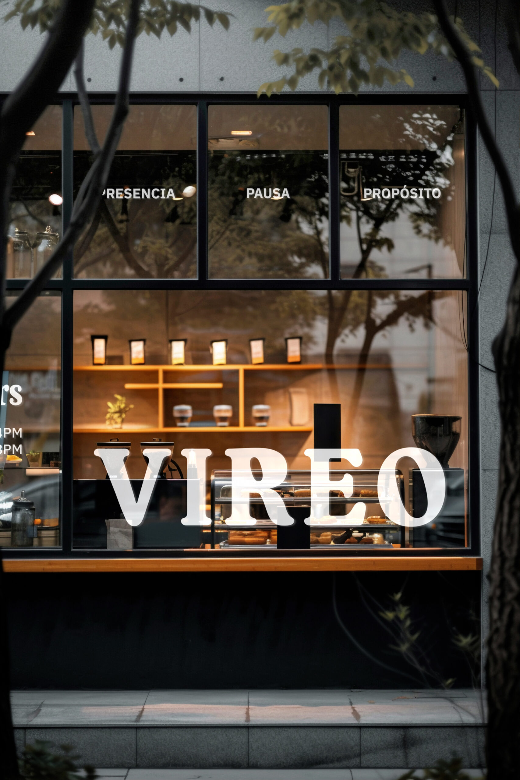
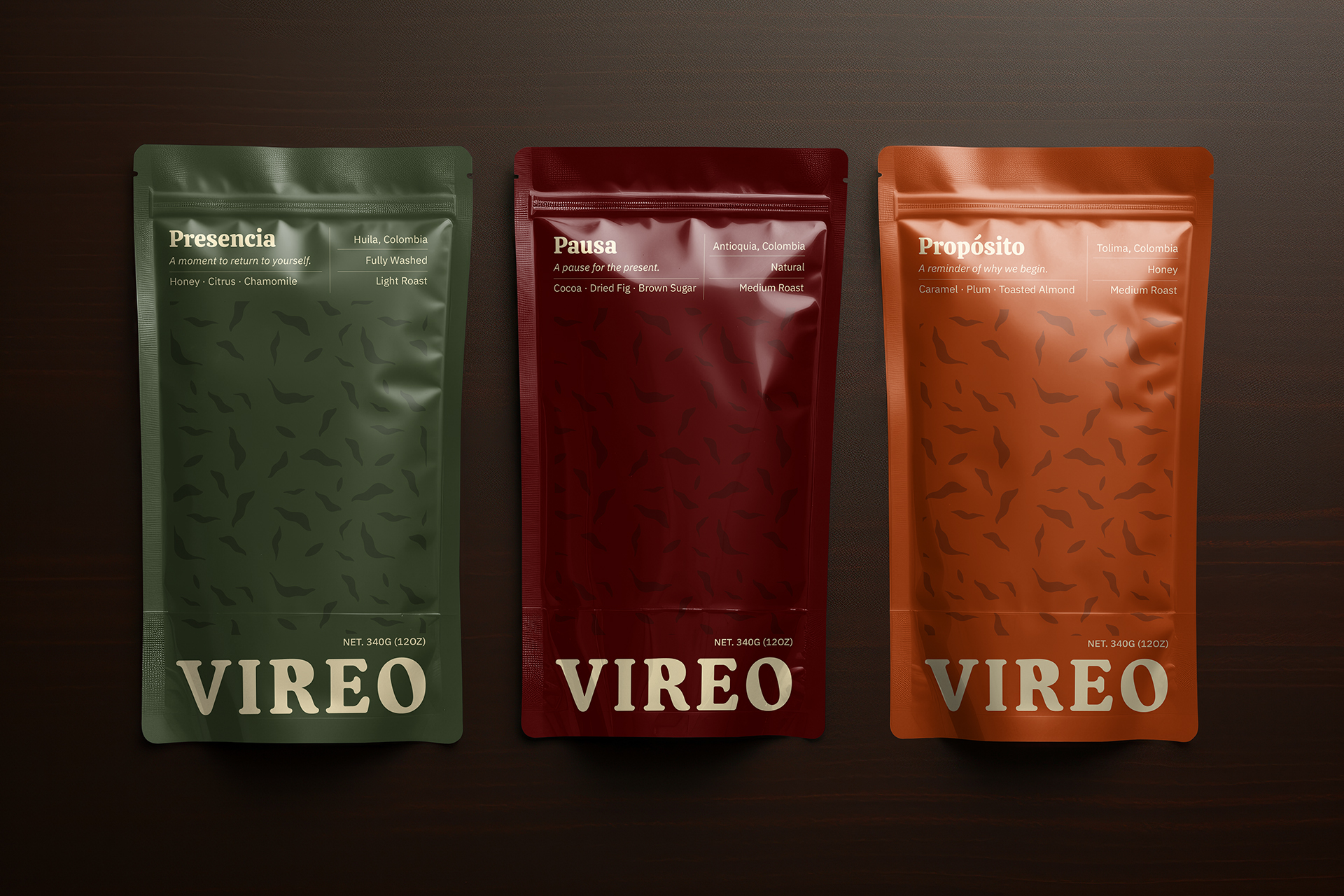
The visual system was designed to feel organic. The isotipo (a single fluid stroke abstracted from a coffee leaf) traces the letter “V” before coming to rest at a point. That point matters because it’s a moment of pause, intentional and still. The logotype uses Calistoga, intervened to soften its geometry (rounded forms, modified counters) introducing a human imperfection that makes the typography feel less designed and more alive.
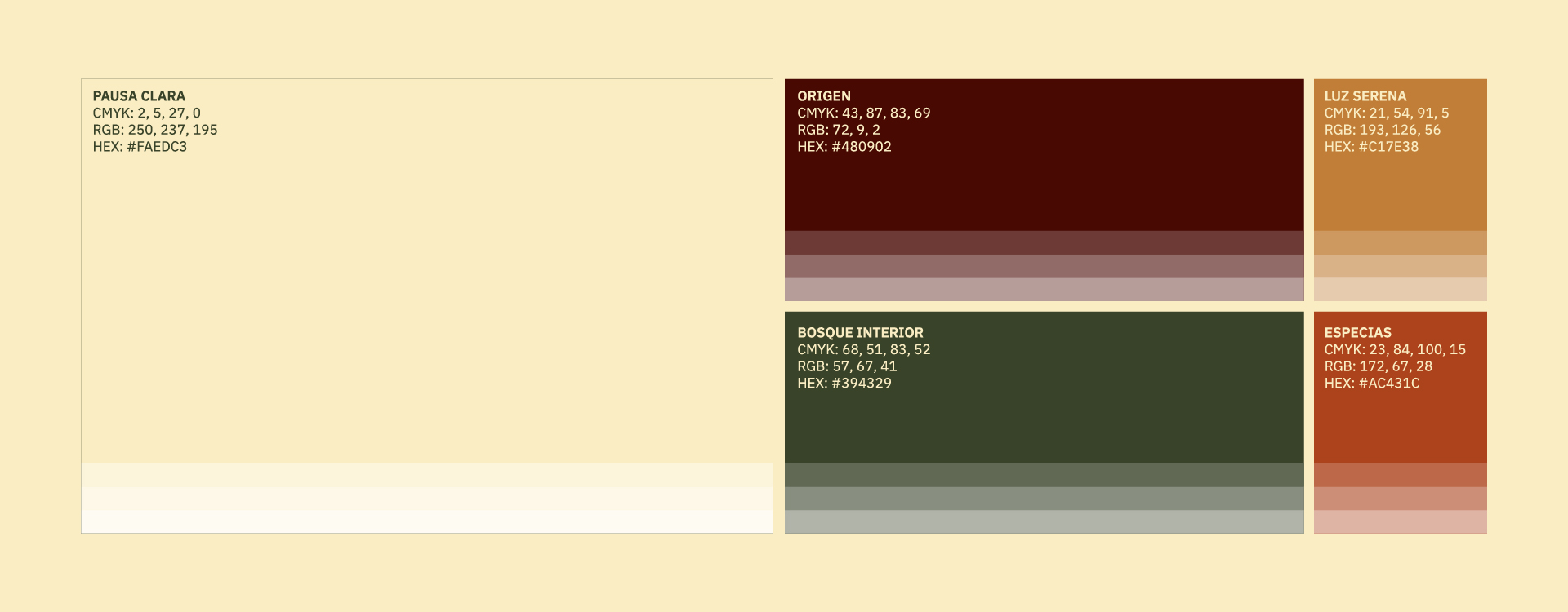
Color was drawn from nature and ritual: deep greens and browns rooted in the earth and the origin of coffee, warm accents that bring character, and a clear tone that holds the system together without crowding it. Typography pairs Calistoga’s warmth with the structural clarity of IBM Plex Sans; bringing expressiveness and order in balance, like the brand itself.
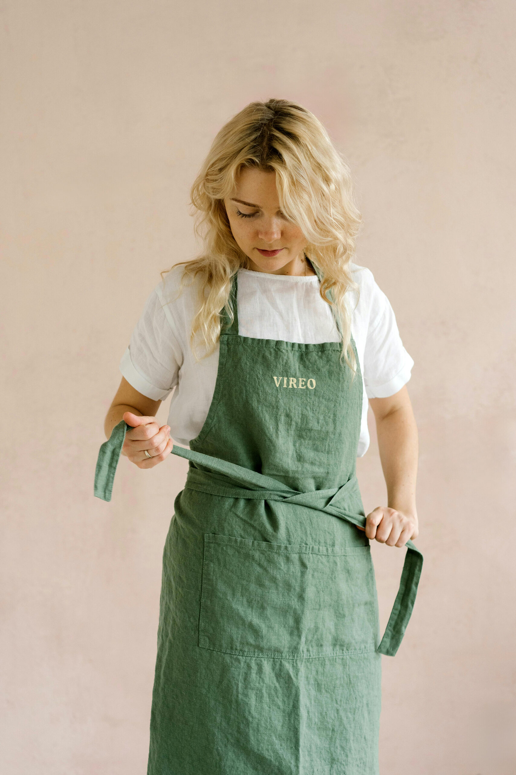
The art direction follows the same intention: natural light, negative space, sensory textures, and human gestures. Everything about being present.
More than a visual identity, this project was about finding the form that a feeling could take. Vireo already knew what it believed; so our work was to make that visible, quietly and with intention.